SOCIB RAMADDA Data Repository
Wiki Text
Previous: Wikis Next: Wiki Display Components Table of contents
RAMADDA User Guide
 
11.1 Wiki Text
The ramadda.org site has many examples of the wiki facility.

There is always some repository entry associated with wiki text. This might be a specific Wiki Entry, we might be treating the description of some arbitrary entry as wiki text using the <wiki> tag, or the wiki text might be coming from a Page Style.

11.1.0 Wiki Editor
In any of these cases RAMADDA provides a wiki text editor:
Wiki Text Editor
Image 1: Wiki Text Editor
  • The buttons allow you to add basic wiki markup.
  • The Add property menu adds RAMADDA specific properties from the entry that is being displayed (e.g., name, description, children entries, etc).
  • The Add entry id menu allows you to specify the entry to use in properties (see below).
  • The Add entry link menu adds wiki links to other entries.
11.1.1 Basic Markup
The RAMADDA Wiki facility generally follows the format that Wikipedia follows. For example:
==Section Heading 1==
===Section Heading 2===
A horizontal line:
----
Lists:
* bullet 1
* bullet 2
** sub bullet 1
** sub bullet 2
* bullet 3
You can escape your wiki text and include raw, unprocessed text with the <nowiki> tag:
Some wiki text
<nowiki>
This is text that does not get formatted
</nowiki>
more wiki text
See the Wikipedia page on Wiki Markup for more information on basic Wiki markup. Note: RAMADDA does not support the Wikipedia HTML table format. For tables its best just to use HTML table markup.
11.1.2 Layout and Display Markup
There are a number of helper layout tags that make it easy to do page layout and display. Snippet
A number of the layouts below (e.g,, table layout) will include a snippet of descriptive text from the entry that is being displayed. The snippet text is defined in the description of the entry with:
Some description here.
<snippet>This is the snippet</snippet>
More description
Inset By default, a page has no margins on the left-side. If you have normal text layout you can make an inset with "+inset":
+inset
...
-inset
This by default gives a 20px left and right margin. To change this you can add any of the attributes, e.g:
+inset top="100" left="50" right="50" bottom="100"
...
-inset
Sections
To get the full page layout like on ramadda.org use the "+section" tag:
+section 
...
-section
If you append a "#" then the row number is kept track of and an even/odd color scheme is applied.
+section  #
...
-section
+section  #
...
-section
If you add label="..." then a header is added. The normal use is:
+section # label="section 1"
...
-section
+section # label="section 2"
...
-section
+section # label="section 3"
...
-section
You can change the background color/image by specifying one of the classes:
+section class="ramadda-section-map"
...
-section
+section class="ramadda-section-lightpink"
...
-section
+section class="ramadda-section-lightblue"
...
-section
+section class="ramadda-section-lightgreen"
...
-section
You can also add a CSS style descriptor
+section style="background: #888; border: 1px red solid;"
...
-section
Grid Layout
There is support for the Bootstrap CSS grid system. To add a "jumbotron" banner do:
+jumbo
This is some text and some more test. Lorem ipsum
-jumbo
You will get something like:
This is some text and some more test. Lorem ipsum
To add RAMADDA's "minitron" smaller banner do
+mini
<h2>Heading</h2>
This is some text and some more test. Lorem ipsum
-mini
You will get something like:

Heading

This is some text and some more test. Lorem ipsum
To do a row layout use the following. The "+col-md-..." correspond to Bootstraps column widths, e.g., col-md-[2,3,4,6,8,9,10,12]. Basically you can have any number of columns within a row. Each column has a width, the sum of which adds up to 12. Three equally spaced columns:
+row
+col-md-4 
Left column contents
-col
+col-md-4 
Center column contents
-col
+col-md-4
Right column contents
-col
-row
Results in:
Left column contents
Center column contents
Right column contents
You can set the widths of different columns:
+row
+col-md-2 
Left column contents
-col
+col-md-10
Right column contents
-col
-row
Results in:
Left column contents
Right column contents
11.1.3 Linking to other entries
Normally in a wiki a link to another page is of the form:
[[Page name]]
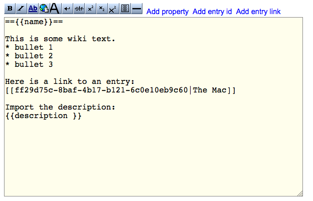
In RAMADDA you can use the name of another entry to create the link. You can use the Add entry link menu to select an entry. This produces wiki text of the form:
[[entry id|Label to show for link]]
e.g.:
[[7ca13e52-8efb-4d17-863f-e17027dbcc22|Earthquake data]]
You can also just specify an entry by name. Either an absolute path:
[[Top entry/Some other entry]]
Or relative to the wiki entry:
[[Some entry]]
You can also set the output type for an entry using the hashtag (#) symbol after the entry id:
[[7ca13e52-8efb-4d17-863f-e17027dbcc22#html.table|Earthquake data as a table]]
which will override the default display. If the entry with the given name does not exist then the link will take one to the create entry form.
11.1.4 Wiki Properties
You can also import content from the current Wiki Page entry or any other entry with the import syntax:
{{property}}
e.g., if we wanted to show the information tabs for an entry we'd do:
{{information}}
For example, if we want to import the information block with it open:
{{information open="true"}}
This would give us:
images/wikiinformation.png
Normally, all property tags refer to the current entry. However, you can specify another entry:
{{information entry="some other entry id or name or 'parent' or 'grandparent'"}}
The entry value can be:
  • The ID of an entry
  • Its full path, e.g., /Top/.../entry_name
  • The parent entry - "parent"
  • The parent of the parent entry -"grandparent"
  • The entry itself - "this"
  • An entry linked to the entry. Either "link" to find the first one or to specify an entry type use "link:entry_type"
The Add Entry ID menu in the editor toolbar allows you to select the entry to use. As a convenience this adds both the ID of the entry as well as its name.

Some of the properties can result in an error message (e.g., image not found, entry not found, etc). You can specify a different message (or blank) with message attribute:

{{someproperty message="some message"}}
For example, you can set up a wiki template that shows an image attachment and a list of entries in a sub-folder called "Links". If you used the below wiki text then you would see displayed "Could not find image" and "Could not find entry" error messages.
{{image src="::*"}}
{{links entry="Links"}}
If, however, you specify a blank message then nothing will be shown:
{{image src="::*" message=""}}
{{links entry="Links" message=""}}
Note: you can specify a prefix and suffix attributes that are only used if the tag was successful. So for example you could specify a heading for the links:
{{links entry="Links" message="" prefix="Here are the links:<br>}}
This would only show when there is a Links sub-folder.
11.1.5 Basic Wiki Properties
The first set of property tags show some information for the entry. Note: the attributes are all optional.
  • {{name}}: Entry name
  • {{entryid}}: Entry ID
  • {{description wikify="true|false"}}: Entry description. If wikify=true then treat the description as wiki text.
  • {{fromdate format="date time format"}}
    {{todate format="date time format"}}
    {{daterange format="date time format" separator=" -- "}}
    {{createdate format="date time format"}}
    {{changedate format="date time format"}}
    Show the different dates available for an entyr. If specified, format the date with the given date time format. This follows the Java date format conventions.
  • {{information}}: The information tabs.
  • {{properties metadata.types="types to show or not show"}}: Show the properties listing. The attribute metadata.types is an optional comma separated list of the metata (or property) types that should be shown or not shown. For example, if you wanted to show all of the properties except for the Project PI property do:
    {{properties metadata.types="!project_pi" message="" }}
    
    Then if you wanted to just show the Project PI property then do:
    {{properties metadata.types="project_pi" message="" }}
    
  • {{html}}: Shows the default html view of the entry. Note: this requires an entry="..." to specify a different entry.
  • {{link linkresource=true|false button=true|false output=someoutput}}: Makes a link to the entry. Set button=true to buttonize the link. Link to the file with linkresource=true. Link to some other view with output=
  • {{map width="width of map" height="height of map" listentries="true|false" listwidth="width or percent"}}: Display a map. If the entry is a folder then display the children entries of the folder. If you do not specify a width then the map will be sized to fit its page. The listwidth is the width devoted to the entry list. This may be a fixed pixel value or a percentage:
    {{map listentries="true" listwidth="25%"}}
    
    If you have a Folder (or other group) and want to just show the Folder and nots it children then do:
    {{map entries="this"}}
    
  • {{earth width="width of map" height="height of map"}}: Display the Google Earth plugin.
  • {{comments}}: Show the comments.
  • {{breadcrumbs}}: Show the breadcrumb path.
  • {{layout}}: This shows the "Layout:" toolbar bar for an entry.
  • {{toolbar}}: Show the entry toolbar.
  • {{image src="image source" alt="alt text" width="image width" link="true|false" left="absolute position" top="absolute position" linkresource="true|false" alt="image alt label"}}: Include an image. If src is not given then this shows the image (if there is one) from the entry. If src is specified it can take on the form:
    src="entry name"
    
    to show an entry. This is equivalent to using entry="...". You can also specify the name of a file attachment to an entry with:
    entry="entryid" src="::attachment name"
    
    Or any attachment with:
    entry="entryid" src="::*"
    
    If link is true, the image displayed will be linked to the entry page, if linkresource is true, it will be linked to the full sized image (the entry resource). height and width can be used to scale the image, the alt attribute will be used in place of the entry id as a label on the image for accessibility.
  • {{menu popup="true|false" title="title to use" menus="file,edit,feeds,view,other"}}: Show the menu actions. If menus is not specified show all of the menus. If menus is specified only show those menus listed. Show all menus in a toggle block:
    {{menu}}
    
    You can specify which menus to show with a comma separated list of menu names. Only show the file and view menu:
    {{menu menus="file,view"}}
    
    Show the menu actions in a popup:
    {{menu popup="true" title="Click here"}}
    
11.1.6 Display Components
There is a set of new "display" wiki tags that allow you to develop rich integrated and interactive search, map and charting wiki pages. There are numerous examples of this facility available at ramadda.org. You can always see the underlying wiki text from the Information or Wiki Text entry menu item. The idea is that there is a new group tag that can manage a number of children displays. Each child display may be located in a fixed location (using layoutHere=false) in the web page or the group can manage the layout of the children displays. The group is defined as: {{group showTitle="true" showMenu="false" layoutType="table" layoutColumns="1" divid="maindiv"}} And the displays are defined as: {{display type="display type" layoutHere="true" ...}} Where type may be one of:
  • entrylist A search form and a list of entries. Specify alternative search providers with the provider argument, e.g.:
    provider=google,arxiv,wolfram
    
  • table Tabular display of data
  • linechart A line chart
  • barchart A bar chart
  • map A map If you have a wiki page that does not have a group but only one or more display tags then a group will be added automatically. The major role for the group is to allow for the different displays to communicate with each other (e.g., creating a new chart, map click, animation, etc) and to layout the set of children displays.

    Display Layout

    You can specify different layouts with the layoutType attribute. The available layouts are:
    layoutType=table
    layoutType=columns
    layoutType=rows
    
    Using the table layout you also specify a number of columns with the layoutColumns attibute. For the columns and rows layout type each child display can specify the column number of row number it should be placed in. For example, for the rows layout if you had:
    {{group layoutType="rows"}}
    {{display display1  row="1"}}
    {{display display2  row="1"}}
    {{display display3  row="1"}}
    {{display display4  row="2"}}
    {{display display5  row="2"}}
    {{display display6  row="3"}}
    
    Would result in (without the border):
    display1display2display3
    display4display5
    display6
    The divid attribute allows you to specify a div tag that is in the wiki page as the location for the group and the displays to place themselves in. For example, below is the (abbreviated) wiki text used to create this page on ramadda.org. We want to have a fixed layout where the entry list is on the left and the map is on the right. Any charts or other display components that are interactively created by the user are managed by the group and layed out below the list and map. To do this we define a regular html table layout that contains a couple of div tags - one for the list and one for the map. We set the IDs of the div tags and then reference those IDs in the display wiki tags below. Likewise, the group has a divid=maindiv which corresponds to the div at the bottom of the page.
    <table width=100% border=0 cellpadding=10>
    <tr valign=top>
    <td width=50%><div id="listdiv"></div></td>
    <td width=50%><div id="mapdiv"></div></td>
    </table>
    
    <div id=maindiv></div>
    
    {{group  layoutType="table"  layoutColumns="1" divid="maindiv"}}
    
    {{display   type="entrylist"   divid="listdiv" }}
    
    {{display   type="map"  layoutHere="true" height="250" divid="mapdiv"}}
    
    When using the display tag you need to specify the type of display. {{display type="entrylist" layoutHere="true" orientation="vertical" showMetadata="false" showTypes="true" name="list1" innerHeight="200" divid="listdiv" formOpen="false"}}:

    Entry List Display

    entryType="type_point_pbo_position_time_series"
    ramaddaBaseUrl="http://community.ramadda.org/repository/repos/data"
    
    11.1.7 Collection Wiki Properties
    The following properties display a collection of entries. By default they are the children entries of the wiki entry but you can specify other groups of entries with any of the following arguments:
    {{property entry="some other entry" 
                   entries="entryid1,entryid2,entryid3.." 
                   entries.filter="file|folder|image|type:some type|geo|suffix:file suffixes"
                   exclude="entryid1,entryid2,entryid3.."  
                   first="entryid1,entryid2,entryid3.."  
                   last="entryid1,entryid2,entryid3.."  
                   sort="name|date"  sortorder="up|down"
                   max="number of entries to use" }}
    The entries attribute is a comma separated list of entry identifiers. They can be specific entry ids or they can be one of a set of relative descriptors:
    • this - the current entry
    • children - the children entry
    • grandchildren - the grandchildren entries
    • greatgrandchildren - the great-grandchildren entries
    • parent - the parent entry
    • grandparent - the grandparent entry
    • ancestors - the ancestors up to the top-level entry
    • siblings - the sibling entries
    • links - the associated or linked entries
    • search - search the entire repository. The search terms are defined as attributes and described below.
    The relative descriptors are applied to the base entry specified with the entry attribute. You can specify an alternative base entry for each descriptor with the syntax:
    descriptor:baseEntryId
    
    So, for example, if you had 2 different Folder entries - folder1 and folder2 and you wanted to list all of the children of each folder you could do:
    {{tree  entries="children:folder1_id,children:folder2_id"}}
    
    You can combine different relative descriptors, e.g.:
    {{tree  entries="children:folder1_id,grandchildren:folder2_id"}}
    

    Search for entries

    When using the term "search" when specifying entries you can specify the following search attributes.
    • search.text="text to search"
    • search.type="entry type"
    • search.bbox="north,west,south,east" spatial bounds
    • search.group="parent entry id" or "this" for the current entry
    • search.filesuffix="file suffix"
    • search.datadate.from="from date"
    • search.datadate.to="to date"
    • search.datadate.relative="relative date, e.g., -3 days, -12 hours, -1 week"
    • search.createdate.from="from date"
    • search.createdate.to="to date"
    • search.createdate.relative="relative date, e.g., -3 days, -12 hours, -1 week"
    • search.changedate.from="from date"
    • search.changedate.to="to date"
    • search.changedate.relative="relative date, e.g., -3 days, -12 hours, -1 week"

    Here are some examples:

    Find all entries with text 'climate':

    {{tree search.text="climate" entries="search"}}
    
    Find all entries with file suffix 'pdf' that have been created in the last 2 days:
    {{tree search.suffix="pdf" search.createdate.relative="-2 days" entries="search"}}
    

    Filtering Entries

    You can filter what entries to use with entries.filter, e.g.:
    entries.filter=file|folder|image|type:some type|geo|suffix:file suffixes
    
    If you specify suffix:file suffixes then this will only match entries that have files with the given suffix. This can be a comma separated list of suffixes, e.g.:
    entries.filter="suffix:.ppt,.pptx,.pdf" 
    
    Or negate them with "!":
    entries.filter=!file|!folder|!image|!type:some type|!geo
    
    So, you could show all of the georeferenced entries in a map and all of the non-georeferenced entries in a list:
    {{map  message="" prefix="==Map=="}}
    
    {{tree message="" prefix="==Non georeferenced entries==" entries.filter="!geo"}}
    
    You can also:
    • If first is defined then these entry ids are put at the front of the list.
    • If last is defined then these entry ids are put at the end of the list.
    • Exclude any entries in the exclude comma separated list of entry ids.
    • Sort entries by name or date with sort
    • If images is set to true then only entries that are image files are included

    Virtual Groups

    RAMADDA provides a "Virtual Group" entry type. This acts as a Folder except a set of entry IDs or searches can be specified. There are a number of examples available here. The Entry IDs field of the Virtual Group can be a list of specific entries, e.g.:
    67259186-574e-4453-a2af-969e1cf658c8
    f5ccdc47-62f7-481a-b67d-bf76e5b34359
    ...
    
    If an entry id has a "+" prefix then the children entries of the specified entry is used
    +67259186-574e-4453-a2af-969e1cf658c8
    +f5ccdc47-62f7-481a-b67d-bf76e5b34359
    ...
    
    You can also specify a search. This is a set of search terms followed by "search". You can specify text to search for, the entry type, spatial bounds and date based search.
    search.text=text to search
    search.type=entry type
    search.bbox=north,west,south,east  
    search.createdate.relative=-1 day
    search
    

    Collection Tags

    • {{tree}}: The {{tree}} tag is used to display the children entries of a folder. It can take the form:
      {{tree title="Links" showtoggle="false" open="true" }}
      The title attribute is used in place of "Children". If showtoggle="false" then the show/hide toggle link is not shown.
    • {{grid}}: Show the children in a grid. e.g., show the grandchildren as a grid:
      {{grid entries="grandchildren"}}
    • {{recent days="number of days to show"}}: Show the most recent N days in a list organized by day.
    • {{imageplayer width="image width" loopdelay="delay in milliseconds" loopstart="true|false" useAttachment="true|false"}}: Show images in an image player, e.g.
      {{imageplayer loopdelay="500" loopstart="true"}}
      If useAttachment is true then, if the entry's file is not an image but it has an attachment that is an image then use the attachment image.
    • {{gallery width="image width" columns="number of columns" showdescription="true"}}: Show a 3 column gallery:
      {{gallery columns="3"}}
      Show a vertical listing of the children entry images:
      {{gallery columns="1"}}
      Set the image width and only show up to 5 images:
      {{gallery  width="300" max="5"}}
    • {{tabs}}: Show the children as tabs:
      {{tabs}}
      Show only the 3 specified entries in tabs:
      {{tabs entries="0af4d166-5723-4775-88fc-b83b72ab47a4,
                       83539d5c-e9d9-408e-b0af-35f480000ae6,
                       49684d25-6af1-4188-a0ae-4d5302d22f2a" }}
      Show only the children of type wikipage in tabs:
      {{tabs entries="type:wikipage"}}
      Additional arguments:
      • tag="some tag name" - The wiki tag to use to show the children. e.g., tag="simple" tag="html"
      • includeicon="true|false" - if true, include the appropriate icon in the tab
      • showlink="true|false" - show a link to the entry (default: true)
      • linklabel="label" - if showlink is true, use label in place of the entry name
      • imagewidth="width" - width of images
      • maximageheight="max height" - maximum height of images
      • linkresource="true|false" - if true, link to the entry resource
    • {{accordian border="0" collapse="true"}}: Show the children in an accordian:
      {{accordian}}
      Uses the same arguments as tabs. If border is non-zero then show a border. If collapse is false then open the first section.
    • {{slideshow}}: Show the children in a slideshow:
      {{slideshow}}

      Uses the same arguments as tabs, plus:

      • autoplay="true|false" - if true, start the slideshow (default: false)
      • speed="secs" - number of seconds to pause on each entry in slideshow
      • border="pixs" - border size in pixels
      • bordercolor="color" - border color (name or hexadecimal value)
      • width="width" - width of the display
      • height="height" - height of the display

    • {{links separator="separator text to use" style="inline css style for the link" class="css class for the link" tagopen="html to prepend to the link - default is li" tagclose="close html" linkresource="true|false if true link to the entry's file or URL; If false link to the entry"}}: Layout links to the entries.
      This produces a set of links to the entries. A bulleted list:
      <ul>
      {{links}}
      </ul>
      
      A bulleted list with the links to the entry's file:
      <ul>
      {{links linkresource="true"}}
      </ul>
      
      If you wanted to make a vertical list do:
      {{links tagopen="<div>" tagclose="</div>"}}
      
      You can create a header with wiki text like:
      <center>
      {{links separator="&nbsp;|&nbsp" tagopen=""}}
      </center>
      
    • {{search type="entry type" search.showform="true|false" search.showheader="true|false"}} The "search" tag performs an entry type specific search and embed it into the wiki. This is the same as the top-level type specific search. You can use any of the "search." attributes defined above, e.g., search.text. The default is to not show the form.
    • {{apply}} The apply tag allows you to apply some tag (e.g., links, map) to a set of entries in turn. You can then layout the results in a variety of ways (e.g., table, tabs); The apply tag is of the form:
      {{apply
      apply.entry="the entry to find the children of"
      apply.tag="some tag to apply to the entries"
      apply.layout="table, accordian or tabs"
      apply.columns="number of columns in table"
      apply.header="text to go before can contain macros ${name} ${url}"
      apply.footer="text to go after"
      apply.border="border width - defaults to 0"
      apply.bordercolor="border color"
      apply.includeicon="true|false"
      ...
      <arguments for the apply tag>
      }}
      
      All of the arguments, including the entry argument are the same as described above but have the prefix "apply.". This way you can mix the arguments that control the apply function with the arguments that you are using for each entry. Say you have the following entries:
      parent
           entry1
                  sub-entry1
                  sub-entry2
           entry2
                  sub-entry3
                  sub-entry4
      
      If you used the apply tag:
      {{apply
      apply.entry="parent"
      apply.layout="tabs"
      apply.tag="links"
      linkresource="true"
      }}
      
      This applies the tag "links" to each main entry. It puts each result in a tab. This tag would make a 2 column table of maps with links to the entries show in the header.
      {{apply
      apply.layout="table"
      apply.columns="2"
      apply.tag="map"
      apply.border="1"
      apply.header="${url}"
      <any map arguments*gt;
      }}
      
    11.1.8 Hiding and showing content
    The <block> tag allows you to easily create a toggle block and/or show or hide content based on the user's device. To show a simple toggle block just do:
    <block>
     any content here
    </block>
    
    You can specify the toggle label title with:
    <block title="Click here to open">
     any content here
    </block>
    
    You can specify whether the block is open or closed:
    <block open="false">
     any content here
    </block>
    
    You can specify whether to show the content or not:
    <block show="mobile" decorate="false">
      this will only show for mobile users
    </block>
    <block show="!mobile" decorate="false">
      this will only show for non-mobile users
    </block>
    
    You can also use the block tag to define a variable or macro that is used later.
    <block var="var_name">
     any content here
    </block>
    
    This will not show the content in place. Rather you can reference and insert the content later with:
     \${var_name}
    </block>
    
    11.1.9 Importing any page
    You can also import any of the views of an entry, e.g., the map view, the OPeNDAP view, the calendar view, etc., with the {{import}} tag:
    {{import output=""}}

    So, if you wanted to show the calendar view of an entry you would do:

    {{import output="calendar.calendar"}}
    To find the correct output identifier just navigate to the page you want to include and look at the url for the output=... url argument and use that.


Previous: Wikis Next: Wiki Display Components Table of contents

Powered by Geode Systems and RAMADDA